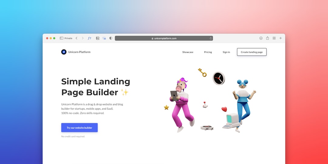
A landing page is a standalone web page designed for one job: converting visitors into leads or customers. Unlike your homepage, which serves everyone and offers multiple paths, a landing page serves a single audience arriving from a specific campaign and offers a single, unambiguous action. That focus is why landing pages consistently outperform homepages for paid traffic, email campaigns, and any situation where you are paying for attention and cannot afford to waste it.
If you are running ads, sending email campaigns, or promoting an offer and sending that traffic to your homepage, you are burning budget. Every visitor who lands on a homepage with navigation menus, blog links, and competing calls-to-action faces a dozen exit routes before they ever reach your form. A landing page removes those routes. It takes the intent someone already expressed by clicking your ad or email and gives them exactly one thing to do next.
This guide covers what a landing page is, when you need one versus a homepage or product page, the anatomy of pages that convert, the mistakes that silently destroy your results, and how to measure whether yours is actually working.
What Is a Landing Page (And What It’s Not)
A landing page is a purpose-built page with a single conversion goal and no navigation distractions. It exists to turn traffic from a specific source (an ad, an email, a social post, a partner link) into a measurable action: a form submission, a booking, a purchase, a download. Everything on the page, from the headline to the form fields, serves that one goal.
Here is what separates a landing page from any other page on your site. First, it has one call-to-action. Not a primary CTA plus three secondary ones. One. Second, it has no site navigation. No header menu, no footer links, no sidebar widgets that lead visitors away. Third, it matches the message of the traffic source. If your ad promises a free audit, the landing page headline talks about that audit, not your company history.
What a Landing Page Is
A focused, single-goal page designed for campaign traffic. It removes choice and creates a direct path from arrival to conversion. The visitor either takes the action or leaves. There is no browsing, no exploring, no getting lost in your blog.
What a Landing Page Is Not
It is not a homepage. It is not a product page with reviews, related items, and cross-sells. It is not a contact page. And it is not a long-scroll sales letter with no form. A landing page is a conversion instrument, not a content destination. If visitors can do three different things on the page, it is not a landing page, it is just a web page with a form on it.
Landing Page vs. Homepage vs. Product Page
The confusion between these three page types is the most common reason campaigns underperform. Each serves a different purpose, serves a different visitor mindset, and should be used in different situations. Sending campaign traffic to the wrong page type is the single fastest way to waste ad spend.
| Dimension | Landing Page | Homepage | Product Page |
|---|---|---|---|
| Primary Goal | One conversion action (form, booking, purchase) | Route visitors to other pages, build brand familiarity | Sell a specific product, answer buying questions |
| Navigation | None. No menus, no links away. | Full site navigation, multiple menus | Site nav plus related products, reviews, cross-sells |
| Number of CTAs | One. Repeated, but always the same action. | Multiple. Explore, learn, contact, browse. | One primary (add to cart) plus secondary options |
| Traffic Source | Paid ads, email, social campaigns | Organic search, direct visits, brand searches | Organic search, shopping ads, category browsing |
| Message Match | Headline mirrors the ad or email that sent traffic | General brand messaging, broad positioning | Product-specific features and benefits |
| When to Use | You are paying for attention and need one action | Visitors arrive with broad or brand intent | Visitors are evaluating a specific product |
The pattern that matters: landing pages are for directed traffic, homepages are for exploratory traffic, product pages are for evaluation traffic. If someone clicked your ad with a specific expectation, a homepage gives them eleven ways to leave without converting. A landing page gives them one way to stay.
When Do You Actually Need a Landing Page?
You need a landing page whenever you are sending traffic from a controlled source (paid ads, email campaigns, social posts) and that traffic arrives with a specific expectation you need to fulfill with a specific action. The rule is simple: if you are paying for the click, you need a landing page.
You Are Running Paid Advertising
Google Ads, Meta ads, LinkedIn ads. Every platform charges you per click. When that click lands on a homepage, the visitor faces navigation, multiple CTAs, and content that has nothing to do with the ad they clicked. They leave. You paid for a bounce. A landing page takes that same click and gives the visitor exactly what the ad promised, with one clear next step. The difference in conversion rate between homepage traffic and landing page traffic from paid campaigns is typically dramatic.
You Are Sending an Email Campaign
Email subscribers who click a link in your campaign have raised their hand. They want the thing you offered. Send them to a landing page built for that specific offer and you capture that intent. Send them to a homepage and they have to find it themselves. Most will not.
You Are Launching a New Offer or Service
A new service, a limited-time offer, a free consultation, a lead magnet. Each of these needs its own page because each has its own message, its own audience, and its own conversion goal. Stacking them onto an existing page dilutes all of them.
When You Do NOT Need a Landing Page
If your traffic is organic search visitors with broad informational intent, they need options. A homepage or content page serves them better. If you are running a brand awareness campaign with no conversion goal, a landing page is unnecessary overhead. And if you have a single-product business with a simple offer, your homepage may function as your landing page, provided it has no navigation distractions and one clear CTA. But that is rare. Most homepages try to be everything for everyone, which is precisely why they convert poorly for campaign traffic.
The Anatomy of a High-Converting Landing Page
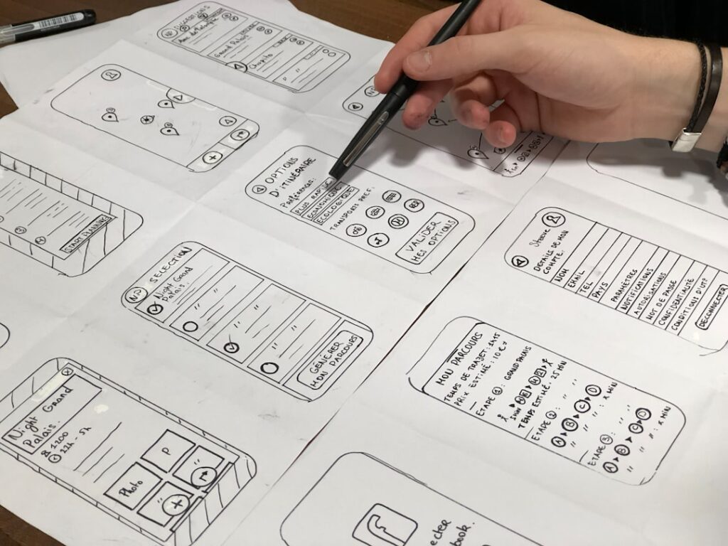
High-converting landing pages are not accidents. They follow a predictable structure where every element serves the single conversion goal. The best pages feel simple because every unnecessary element has been stripped away. That simplicity is engineered, not accidental.
1. A Headline That Matches the Traffic Source
Your headline is the first thing visitors read, and it must immediately confirm they are in the right place. If your ad says “Free SEO Audit for London Plumbers,” your landing page headline should say something close to “Get Your Free SEO Audit, Built for London Plumbers.” This is called message match, and it is the single most underused technique in landing page design. A mismatch between ad and page creates instant doubt. The visitor thinks they clicked the wrong thing and leaves within seconds.
The headline should communicate three things: what you are offering, who it is for, and why it matters now. Not all three need to be in the headline itself, but all three should be visible above the fold within the first scroll.
2. A Subheadline That Clarifies the Offer
The headline grabs attention. The subheadline explains the mechanism. If the headline says “Get Your Free SEO Audit,” the subheadline should say “A 15-minute video walkthrough showing exactly where your site loses rankings and what to fix first.” The subheadline turns interest into desire by making the offer concrete and specific.
3. A Single, Specific Call-to-Action
One action. One button. Repeated two or three times on the page at natural scroll breaks, but always pointing to the same action. The button text should describe the outcome, not the mechanics. “Get My Free Audit” beats “Submit.” “Book My Strategy Call” beats “Contact Us.” Every word on that button should make the visitor want to click it.
4. Social Proof That Reduces Risk
Testimonials, client logos, case study links, ratings, certifications. Visitors do not trust your claims about yourself. They trust what other people say about you. The best social proof is specific: a testimonial that names the client, their industry, and the result they got. “Increased qualified leads by 40% in three months” beats “Great service, highly recommend.”
5. A Form That Asks for the Minimum
Every form field is friction. Each additional field reduces conversions. Ask only for what you need to take the next step. If the next step is a phone call, you need a name and a phone number. You do not need their company size, their budget, or their job title at this stage. Ask for that later, once they have raised their hand. The landing page form is not a qualification tool, it is a permission slip.
6. A Visual Hierarchy That Guides the Eye
The page should lead the visitor’s eye from headline to subheadline to CTA to proof to form, in that order, without any element competing for attention. Large elements dominate small ones. Color contrast draws the eye to the CTA button. White space creates breathing room. A page that feels cluttered feels untrustworthy, and visitors who feel overwhelmed leave.
7. A Thank-You Page or Confirmation
After the form is submitted, the experience is not over. A thank-you page confirms the action, sets expectations for what happens next (“We will call you within 24 hours”), and can offer a secondary action like downloading a resource or following on social. This page also gives you a clean conversion event to track in analytics.
Common Landing Page Mistakes That Kill Conversions

Most landing page failures are not caused by missing elements. They are caused by extra elements that dilute focus and create exit paths. Here are the mistakes that quietly destroy conversion rates on otherwise well-intentioned pages.
Leaving Site Navigation On the Page
This is the most common and most damaging mistake. The entire point of a landing page is to remove exits. A navigation bar at the top of your landing page gives visitors permission to wander. Some will click to your About page. Some will read your blog. Most will not come back. Remove the navigation entirely. If your CMS makes this difficult, your CMS is working against your conversion goals.
Offering Multiple CTAs
A page with “Sign Up,” “Learn More,” “Watch Demo,” and “Contact Sales” buttons is not a landing page. It is a homepage with a form. When visitors face multiple options, they experience decision paralysis and choose none of them. One action, repeated. That is the rule.
Asking for Too Much Information
Every form field you add costs conversions. Research from form optimization studies consistently shows that reducing fields from five to three can increase conversions significantly. The exact numbers vary by industry and offer, but the principle holds: ask for less, get more. If you need qualification data, collect it in a follow-up step after the visitor has committed, not on the initial form.
Failing to Match the Ad Message
If your ad says “50% off” and your landing page says “Special offer,” you have created a disconnect. The visitor clicks because they want the 50% off. When they do not see it immediately, they assume the ad was misleading and they leave. The landing page headline should echo the ad headline as closely as possible. This is message match, and it is non-negotiable.
Writing Copy That Talks About You, Not the Visitor
“We are a leading provider of…” is the fastest way to lose a visitor’s attention. Your landing page is not about you. It is about the visitor and the outcome they want. Frame every sentence from their perspective: “Get your free audit,” not “We offer free audits.” “See how much you could save,” not “Our platform helps customers save.” This shift sounds small. Its impact on conversions is not.
Ignoring Mobile Experience
If your landing page looks great on desktop but has a tiny form, overlapping text, or a CTA below the fold on mobile, you are losing the majority of your visitors. Most paid social traffic arrives on mobile. Test your page on a real phone, not just a responsive preview. If the form is hard to tap or the page loads slowly, you are paying for clicks that will never convert.
How to Measure Whether Your Landing Page Is Working

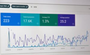
A landing page without measurement is a guess. You need to know your conversion rate, your cost per conversion, and where visitors drop off. Without these numbers, you cannot improve. With them, every page becomes a system you can optimize.
The Core Metrics
Conversion Rate: The percentage of visitors who complete the target action. This is your headline metric. For lead generation landing pages, a conversion rate between 2% and 5% is common. Pages above 5% are performing well. Pages below 2% need work. Context matters, though: a high-ticket consulting offer will convert at a lower rate than a free download, and that is expected.
Cost Per Conversion: Total ad spend divided by conversions. This tells you whether the page is profitable. A page that converts at 3% with a cost per click of $2 gives you a cost per conversion of roughly $67. Whether that is good depends on the value of a lead to your business.
Bounce Rate and Time on Page: A high bounce rate (above 70%) on a landing page is not always bad, since a single-page experience with one CTA will register as a bounce if the visitor converts and leaves. But a high bounce rate combined with a low conversion rate means visitors are arriving and leaving without acting. Time on page under 10 seconds means your headline or message match is failing.
Form Abandonment: If you use a form analytics tool, you can see which fields cause visitors to drop off. The field where most people leave is usually the field asking for too much. Remove it or make it optional.
Setting Up Tracking Properly
Install analytics (Google Analytics 4 or a comparable platform) and configure conversion events for your form submissions. If you are running ads, set up platform-specific tracking: Meta Pixel for Facebook ads, Google Ads conversion tracking for Google campaigns. Without these, you are flying blind. You will not know which traffic sources produce conversions and which waste budget.
If your landing page is part of a broader web strategy, consider working with a team that builds conversion-focused websites where tracking, analytics, and lead capture are architected from the ground up rather than bolted on after launch.
A Simple Testing Framework
Start with one variable at a time. Test your headline first, because it has the largest impact on whether visitors stay or leave. Then test your CTA copy. Then your form length. Then your social proof placement. Change one thing, measure for two weeks or until you reach statistical significance, then move to the next. Avoid testing everything at once, because you will not know which change caused the result.
Next Steps: Audit Your Current Landing Page
If you have a landing page live right now, run it through this checklist. Does the headline match your ad or email? Is there any site navigation on the page? How many CTAs are competing for attention? How many form fields are you asking for? Does the page load in under three seconds on a mobile connection? Does the copy talk about the visitor or about you?
Every element that does not serve the single conversion goal is working against you. The fastest wins come from subtraction: remove navigation, reduce form fields, eliminate competing CTAs. Then improve what remains: sharpen the headline, make the CTA specific, add credible social proof. Then measure the difference.
If you do not have a landing page yet and are sending campaign traffic to your homepage, you are leaving conversions on the table every day your campaigns run. The page you need is not complex, but it needs to be built with conversion architecture from the start, not assembled from a template and hoped for. If you want to see what a high-performance version looks like for your specific business, tell us about your project and we will show you exactly what is possible.
Have questions about whether your campaign needs a dedicated landing page? Our team at futurelinkz.com is here to help you build pages that convert traffic into clients, not just visits.
Frequently Asked Questions
What is a landing page in simple terms?
A landing page is a standalone web page designed for a single conversion goal, such as capturing a lead or making a sale. It has no site navigation and one call-to-action, so visitors arriving from an ad or email have a clear path to convert instead of getting distracted by other options.
What is a good conversion rate for a landing page?
For lead generation landing pages, a conversion rate between 2% and 5% is typical. Pages converting above 5% are performing well, while those below 2% usually need optimization. The right benchmark depends on your industry, offer type, and traffic quality, so context matters when evaluating your numbers.
Do I need a landing page or can I use my homepage?
If you are paying for traffic through ads or email campaigns, you need a landing page. Homepages serve broad, exploratory traffic with multiple navigation options and competing calls-to-action, which causes campaign visitors to leave without converting. Landing pages focus that traffic on one action.
How many form fields should a landing page have?
Ask for the minimum information needed to take the next step. For most lead generation pages, that means name and email or name and phone number. Every additional field reduces conversions. Collect qualification data in a follow-up step after the visitor has committed, not on the initial form.
What is the biggest landing page mistake to avoid?
Leaving site navigation on the page is the most common and damaging mistake. A navigation bar gives visitors permission to wander away from your conversion goal. Remove it entirely so the only path forward is the single call-to-action you want them to take.