
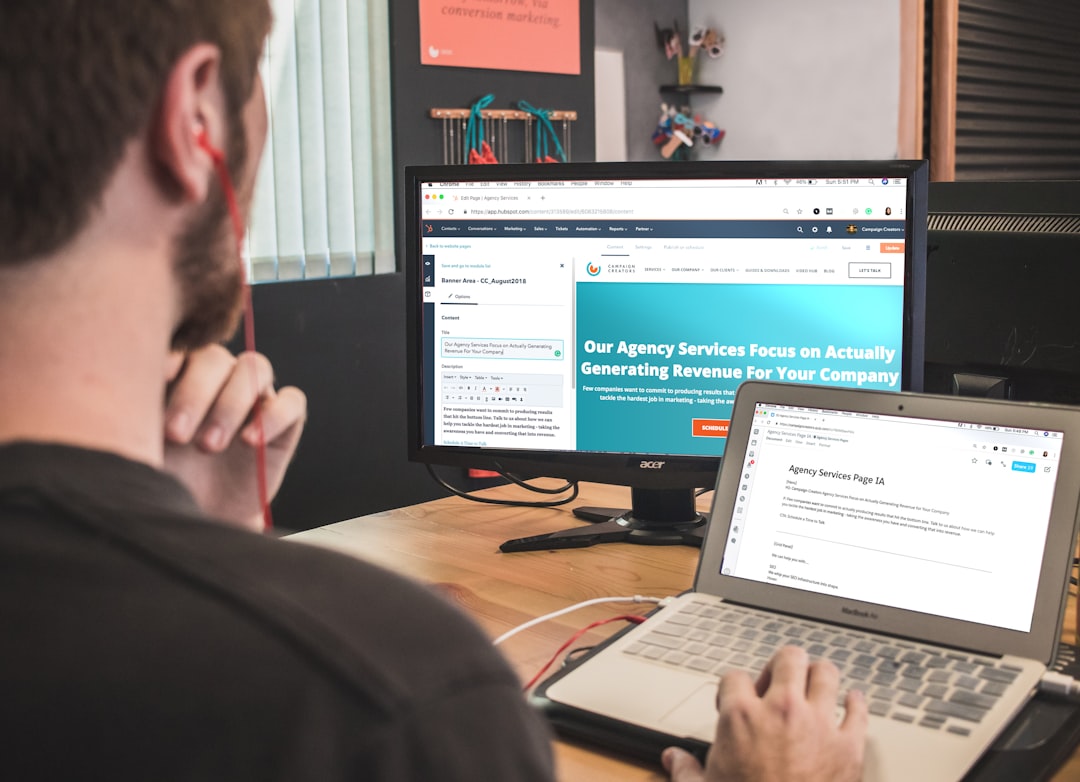
Most landing pages look fine. They load, they have a headline, there’s a button somewhere. But “looks fine” is not the same as “converts.” Unbounce’s Q4 2024 analysis of 41,000 landing pages found a median conversion rate of just 6.6% across all industries. The top 25% of pages convert at more than triple that rate. The gap between average and excellent is not a design budget problem. It is a strategic clarity problem.
This teardown works through 27 real-world landing page examples across four major categories: lead gen for service businesses and agencies, SaaS and free trial pages, ecommerce product pages, and high-ticket offer pages. For each example or group, we annotate the specific choices that drive conversion — and the specific choices that kill it. The goal is a mental model you can carry into your next briefing session or your next revision.
What Makes a Landing Page Worth Analyzing?
Not every page with a form and a button qualifies as a real landing page. For this teardown, we define a high-quality example as a page built for a single, measurable conversion goal, separated from site navigation, and matched to a specific traffic source. That last criterion matters more than most people realise.
A page worth analyzing shares three observable traits: it has a clear answer to the visitor’s first question (“What is this and is it for me?”), it places proof before the first ask, and it removes every exit path that does not lead toward the conversion. Pages that fail any of these three criteria are not landing pages — they are glorified homepages, and they perform accordingly.
The analytical framework we apply across every example below is the same three-question test a visitor runs through in the first ten seconds:
- What is this? (Headline clarity)
- Is it for me? (ICP specificity)
- Why should I trust it? (Social proof placement)
Research consistently shows that the difference between a page converting at 8% versus 1.5% is rarely visual. It is whether those three questions are answered above the fold, before the visitor has invested any scrolling time. Keep that lens in mind as you read through every example below.
Lead Gen Landing Page Examples (Service Businesses & Agencies)
Lead gen pages for service businesses are the most misunderstood page type. Founders treat them like brochures. They should be treated like salespeople: ask for one thing, answer the most likely objections, and make the next step feel safe.
Example 1: The Specialty Free-Gift Page (Condair)
Condair, an industrial humidification company, ran a lead generation page offering a free desktop hygrometer to qualified prospects. The page converted at 83%, generating over 2,800 leads. That result is not magic. It is surgical targeting.
The annotation: most businesses offer generic lead magnets — ebooks nobody reads, webinars nobody watches. What Condair did was offer a free item that only their exact ICP (facilities managers concerned with humidity levels) would want. Anyone outside that audience self-selected out. Result: near-perfect lead quality, and a conversion rate that looks impossible until you understand the mechanism.
The takeaway: Specificity in your lead magnet filters out bad leads and dramatically improves the rate at which ideal leads convert. A targeted free offer to a narrow audience will almost always outperform a broad offer to everyone.
Example 2: The Problem-Promise Page (B2B Outreach Agencies)
Outreach and lead generation agencies face a specific page design challenge: their service is technical enough to require explanation, but walls of copy kill conversions before trust is established. The best examples in this category use what we call the layered proof structure.
Analysis of high-performing B2B lead gen pages shows that the top performers do not just list client logos — they lead with a kicker phrase that frames the social proof (“Trusted by 200+ growth teams”), follow with a reinforcing headline, then display the evidence. This three-layer approach converts measurably better than logos alone, because it tells the visitor how to interpret the proof before they see it.
The annotation: Every page in this category that converts above average does one thing consistently: it uses bullet-formatted copy with clear “Why us” and “What you get” sections to make long copy scannable. The best-performing B2B service page is not short. It is structured.
Example 3: The Webinar Registration Page
Webinar registration pages are among the highest-converting lead gen formats when done correctly, with top performers hitting 15% or above. The reason is structural: a webinar has a specific outcome, a specific time, and a specific commitment level. All three reduce hesitation.
What the best webinar registration pages do differently from the worst: they answer “why show up?” with a tight benefit stack rather than vague promises. They specify what the attendee will be able to do after the session — not just what topics will be discussed. And they keep the flow to one offer, one CTA, one form. No sidebar links. No secondary asks. Nothing that creates a decision other than “register or don’t.”
The annotation: The single most common failure in webinar registration pages is a vague headline. “Join us for our digital marketing webinar” tells a prospect nothing they care about. “How to cut your client acquisition cost by 40% in 90 days” tells them everything. Specificity in the outcome language is the conversion lever.
Example 4: The Financial Services Lead-Gen Page
Financial services landing pages face a unique challenge: the visitor is protective of their data before they understand the value. Trust is not a nice-to-have — it is the primary conversion bottleneck. Industry teardowns confirm that the design of financial lead gen pages needs to communicate institutional reliability before the copy communicates benefit.
The annotation: the best examples in financial services use clean, utility-focused design with no animations, no parallax, and no gimmicks. The visual tone communicates “we handle large sums responsibly” before a single word is read. Bold typography stating a specific outcome — a savings amount, a time saved — converts significantly better than vague benefit language like “Manage Your Finances Better.” Specificity converts; vagueness bounces.
The takeaway: For regulated or trust-sensitive industries, the visual design carries a heavier conversion burden than copy. A clean, professional page signals competence. A flashy page signals risk.
Example 5: The Local Service Business Page
Home service businesses — contractors, HVAC, remodeling — have one advantage other categories don’t: the work is visual. The best local service landing pages use portfolio imagery rather than lifestyle stock photography. Homeowners choosing a contractor need to see real completed work, not a smiling family in a kitchen. The difference in perceived trust is substantial.
A/B tests in this category show that replacing generic stock photography with actual project photos can lift conversions by 30% or more — because the visitor’s objection is not “do I want this?” but “can this business actually deliver?” Real project photos answer that objection visually, before copy is even read.
SaaS & Free Trial Landing Page Examples
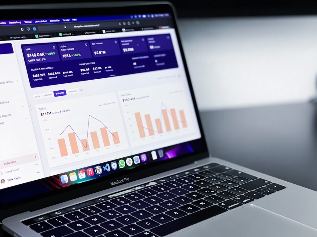
SaaS landing pages convert at a median of 3.8% — well below the all-industry median of 6.6%. That is not because SaaS products are bad. It is because most SaaS landing pages are built around features, not outcomes. The top performers reach 8–12%. The difference is not budget. It is messaging and structure.
Example 6: Notion — Outcome Before Scroll
Notion’s landing page does something most early-stage SaaS products fail to do: it commits to a single outcome before the visitor scrolls. The hero section shows a real product screenshot — no stock photos, no abstract illustrations — paired with one CTA. The copy leads with a result, not a feature list. That is the reason it converts.
The annotation: Notion’s approach works because it collapses the gap between “what is this?” and “why does it matter?” in a single headline. When your above-the-fold copy names the outcome the visitor cares about — not the mechanism that delivers it — you remove the cognitive work that causes people to bounce. Every word the visitor has to decode is a conversion point they might not reach.
Example 7: Loom — The Embedded Demo Hero
Loom’s landing page solves the single biggest SaaS conversion problem: abstraction. Most SaaS products are hard to visualize before you’ve used them. Loom’s hero section includes an embedded product demo video that autoplays silently. The visitor sees the product working before they have invested any time. Movement without sound is attention-grabbing without being intrusive. It is the software equivalent of a food court sample.
The annotation: An embedded product demo in the hero converts better than any screenshot because it answers “does this actually work?” before the visitor has to ask. If your product requires demonstration to understand its value, embedding a short video above the fold is one of the highest-leverage changes you can make to the page.
Example 8: Shopify — Radical Form Reduction
Shopify famously increased free trial sign-ups by reducing their sign-up form to a single field: an email address. This one change illustrates a principle that most SaaS founders resist: every additional form field reduces conversion rate by roughly 5–10%. Most SaaS companies ask for too much too early, at the top of funnel, before the visitor has decided they want the product.
The annotation: The best-converting SaaS free trial pages ask for one or two fields maximum at the top of funnel — email and password, or just email. The qualification questions come later. Reversing this order — asking for business size and use case before asking for the email — is one of the most reliable conversion killers in SaaS.
Example 9: Vercel — Developer-Specific Friction Reduction
Vercel’s landing page targets frontend developers with a specific outcome: “Deploy web projects with zero configuration.” The dark-mode UI matches the design aesthetic of its developer audience. The hero shows a real deployment dashboard, not a diagram, and uses a specific start time signal: “Deploy in 30 seconds.” That single phrase removes two of the most common developer friction points: fear of a long setup process, and uncertainty about whether the free tier requires a credit card.
The annotation: Audience-specific design goes beyond aesthetics. When Vercel uses a dark UI, it signals to developers that the product was built by people who understand them. Signals of cultural alignment reduce conversion friction more than most explicit trust tactics do.
Example 10: Monday.com — The Story-Driven Hero
Monday.com leads with a hero section that shows workflow value in under five seconds. Their headline stays under 44 characters for maximum clarity, and micro-animations guide the eye toward the main CTA without overwhelming the page. The layout is built for two buyer mindsets simultaneously: high-intent users who want to start immediately, and research-stage users who need a demo before committing.
The annotation: Monday.com’s two-CTA architecture (“Start free” + “Book a demo”) is not a compromise — it is a strategic decision to serve two distinct intents from a single page without competing for attention. This pattern, used by Asana, Webflow, and Intercom as well, works because the CTAs are hierarchically clear: the primary free trial CTA is visually dominant, and the secondary demo option is subordinate in size and color.
Example 11: Basecamp — Real Numbers as Proof
Basecamp rebuilt their landing page with bold headlines and a specific social proof statement: “4,000 businesses signed up last week.” That single line does more conversion work than any feature list could. This direct approach to project management pain produced a measurable conversion lift because the number is specific, recent, and implies that the decision to sign up is one that smart businesses are making constantly.
The annotation: “Join thousands of happy customers” is a throwaway line. “4,000 businesses signed up last week” is a conversion argument. Specificity is the difference between social proof that registers and social proof that gets scrolled past.
Example 12: Fathom vs. Gong — The Competitor Conquest Page
Fathom’s competitor conquest page targeting Gong users sets a high bar for this page type. The page leads with a contract buyout offer to remove switching friction, uses a 90% price advantage in the headline, and segments visitors with a short questionnaire to confirm switch intent. Proven elements include TCO breakdowns, feature matrices, and switching resources that lower perceived risk at every stage.
The annotation: Conquest pages convert because the visitor arrives with the highest possible intent: they are already using a product and are dissatisfied. Every friction point removed — switching costs, migration complexity, price risk — directly translates to conversions. If you have a clear pricing or feature advantage over a dominant competitor, a dedicated conquest page is one of the highest-ROI pages you can build.
Ecommerce & Product Landing Page Examples
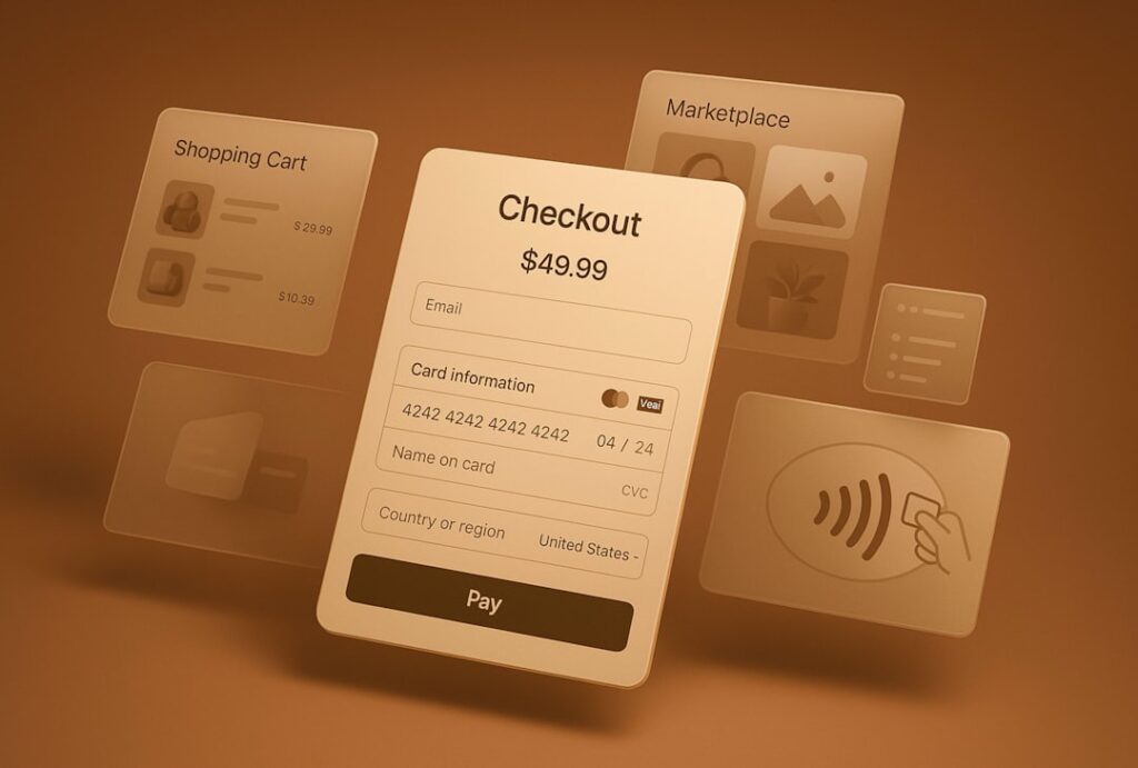
Ecommerce landing pages convert at a median of 4.2%. Top performers hit 11.4% or higher. The single biggest difference between those two groups is not traffic quality or product desirability — it is whether the page strips away every exit path and focuses exclusively on one offer. Ecommerce pages that include full navigation menus, related product carousels, and multiple CTAs are not landing pages. They are product pages masquerading as landing pages, and they perform accordingly.
Example 13: Savile Row — Deep Audience Targeting
Savile Row created dedicated landing pages for specific customer segments, including a page built exclusively for UK shoppers looking for formal men’s shirts. That page converted 74% of thousands of visitors. The reason is not clever design. It is the depth of targeting: not UK shoppers, not UK shirt shoppers, but UK shoppers seeking formal shirts, served a page that addresses their specific needs for fit, color, style, and UK shipping.
The annotation: Every layer of audience specificity you add to a landing page increases its relevance to the visitor who matters. A page that speaks to everyone converts no one. A page that speaks to exactly the person who landed on it can convert at rates that look statistically impossible.
Example 14: Tattly — Lifestyle Imagery That Sets the Context
Tattly’s landing page for custom temporary tattoos does something most ecommerce pages fail at: it makes the product feel personal before you scroll. The hero image shows real tattoos on real hands — not product-on-white-background shots. The photography communicates exactly who the product is for without saying it in text. A shopper understands the use case within two seconds of landing.
The annotation: Lifestyle imagery that shows the product in context performs significantly better than product photography on a white background, because it answers the underlying question every shopper has: “What will this look like in my actual life?” If you can show the product in use before the visitor reads a single headline, you remove one of the most common pre-purchase objections.
Example 15: Axis Smart Shades — Objection Handling in the Hero
Axis sells smart window shades — a product that intimidates non-technical buyers. Their landing page addresses the primary fear directly: “no tools, no drilling,” and visually shows the installation process. Short copy blocks with clear CTAs make the page feel approachable rather than overwhelming. They do not bury the ease-of-installation message in an FAQ. They lead with it.
The annotation: For any product with an installation, technical, or usage complexity component, your headline or subheadline should directly address the “is this going to be complicated?” fear. If that fear is not answered in the first viewport, it will not be answered at all — because the visitor will have left.
Example 16: Miracle Made Towels — The Risk-Reversal Stack
Miracle Made’s landing page stacks four conversion triggers in sequence: benefit bullets that speak to the specific problem the product solves, a 30-night trial guarantee, free returns, and a review carousel. The FAQ section handles specific objections about fabric care and durability without requiring the visitor to leave the page or contact support.
The annotation: The 30-night trial does the heaviest conversion lifting here. It transforms the visitor’s decision from “Should I buy these towels?” to “Should I try these towels for free?” That reframing shifts the visitor from evaluation mode to commitment mode. Risk-reversal elements — guarantees, free returns, trial periods — do not just reduce anxiety. They change the nature of the decision being made.
Example 17: Boiron ColdCalm — Trust Architecture for Health Products
Boiron’s health product landing page flows in a deliberate sequence: product benefits first, customer testimonials second, ingredient transparency third. For health products, this sequence matters. People need to understand what they are putting in their bodies before they buy, and the page addresses this anxiety in the right order — leading with “why it works,” then proving it with evidence, then demonstrating exactly what it contains.
The annotation: Trust architecture is not just about what you include — it is about the sequence in which you present it. For skeptical-purchase categories (health, supplements, financial products), leading with ingredients or disclaimers before benefits is backwards. Benefits first earns the scroll. Proof second validates the benefit claim. Transparency third removes the final objection.
Example 18: st33p Coffee — Pricing in the CTA Button
st33p, a single-serve coffee subscription, opens their landing page with three benefit bullets visible without scrolling: single-serving packs, monthly delivery, and no commitment. The pricing is embedded directly in the CTA button rather than hidden on a separate page. This is a subscription product, yet the page never feels like it is locking you in.
The annotation: Hiding pricing until checkout is one of the most common ecommerce conversion mistakes. When pricing appears in the CTA button itself, it removes the most common objection a visitor has before clicking. “See Plan Options” creates anxiety. “$29/month — Cancel Anytime” removes it. Transparency about price and terms is a trust signal, not a vulnerability.
High-Ticket Offer Landing Page Examples
High-ticket landing pages — consulting retainers, coaching programs, agency services priced at $5,000 or more — operate by different rules than every other page type. The primary conversion goal is not a purchase. It is a conversation. The page’s job is to pre-qualify, establish trust, and create enough belief in the outcome to get a qualified prospect to book a call or submit an application. Length, specificity of proof, and transparency about the offer structure all carry more weight here than visual design.
Example 19: Executive Coaching — Personalized Page Architecture
An executive coaching firm targeting C-suite leaders at technology companies tested personalized landing pages against a generic page. Each prospect received a page with their company name, industry-specific pain points, and a custom video intro. The personalized page converted at 24%. The same generic page converted at 9%.
The annotation: This is the clearest demonstration that for high-ticket offers, personalization is not a nice-to-have — it is a revenue variable. When your buyer is a C-suite executive, they do not scroll through marketing pages looking for something relevant to them. You have to make it immediately, unmistakably relevant before they decide to engage.
Example 20: Coaching Sales Page — Showing the Method, Not Just the Dream
The best coaching sales pages do something most get wrong: they explain the methodology behind the transformation, not just the transformation itself. A well-structured coaching page breaks down the unique philosophy of the program — not buried in an FAQ section, but front and center in the body of the page. This builds belief in the process before the CTA even appears. Without belief in the how, the promise of the what is not credible.
The annotation: One tactic that consistently separates high-converting coaching pages from low-converting ones: explicitly stating who the offer is not for. This is counterintuitive to most founders. But clearly qualifying out the wrong prospect makes the right prospect feel certain they have found what they were looking for. Relief is a conversion emotion.
Example 21: The Consulting Application Page
High-ticket consulting pages should use an application CTA rather than a “book a call” CTA where possible. The language of application implies a selection process — which creates scarcity and elevates the perceived value of the offer. Replacing “Book a Free Call” with “Apply to Work With Us” or “See If You Qualify” shifts the power dynamic and pre-qualifies intent. Prospects who complete an application are more committed than prospects who click a calendar link.
The annotation: The application page format also gives the sales team a structured qualification signal before the call. A three-to-five question application that asks about current revenue, biggest challenge, and timeline gives more conversion leverage than any amount of extra copy on the page itself.
Example 22: The Webinar-to-High-Ticket Bridge
Tax expert Michael Rozbruch built a high-ticket coaching funnel anchored on a live training webinar. The homepage established authority through extensive social proof before directing traffic to a webinar registration page. The webinar warmed prospects, and a follow-up sequence converted them to a strategy call. The landing pages at each stage of the funnel were built around one goal — not the entire funnel’s goal, but the next step’s goal.
The annotation: High-ticket funnels fail when any single landing page tries to carry the weight of the entire buying journey. The webinar registration page only needs to sell the webinar. The sales page only needs to sell the call. Breaking each stage into a single-goal page is the structural reason this approach works at scale.
Patterns Across High-Performing Landing Pages
After analyzing dozens of examples across four distinct offer types and price points, the same structural decisions appear in every high-converting page. These are not design trends. They are conversion principles that hold regardless of industry, price point, or traffic source.
| Page Type | Median Conversion Rate | Top 25% Conversion Rate | Most Impactful Single Variable |
|---|---|---|---|
| All industries (overall) | 6.6% | 11%+ | Headline specificity |
| SaaS free trial | 3.8% | 8–12% | Outcome-led headline + single CTA |
| Ecommerce product | 4.2% | 11.4% | Risk-reversal (guarantee/trial) |
| Financial services | 8.4% | 15%+ | Trust architecture and proof placement |
| Lead gen (webinar) | 15–20% | 30–40% | Specificity of the promised outcome |
| High-ticket consulting/coaching | 2–5% | 10–15% | Methodology transparency + social proof depth |
The patterns that appear consistently across every high-performing page:
- One conversion goal, one primary CTA. Research shows that having more than one offer can cut conversion rates by up to 266%. The best pages repeat the same CTA as you scroll, not a menu of different next steps.
- Social proof appears before the first ask. Logos, stats, review badges, and customer quotes show up early — often before the hero CTA — because proof reduces perceived risk before commitment is requested.
- Copy is written at a 5th–7th grade reading level. Unbounce’s benchmark data found that pages with copy at a 5th–7th grade reading level convert at 11.1%, versus 5.3% for college-level copy. Simpler language is not less intelligent. It is more considerate of the reader’s time and attention.
- Navigation is removed or suppressed. Every link in a navigation menu is an exit path. High-performing campaign pages strip the nav entirely and keep the header to logo left, CTA right.
- Form fields are minimized at the top of funnel. Landing pages with five or fewer form fields convert 120% better than those with more. Every field beyond what is necessary is a conversion penalty.
- Page load speed is treated as a conversion variable, not a technical detail. Pages that load in one second have three times the conversion rate of pages that take five seconds to load. Every second of delay is a measurable revenue leak.
What the Worst Examples Have in Common
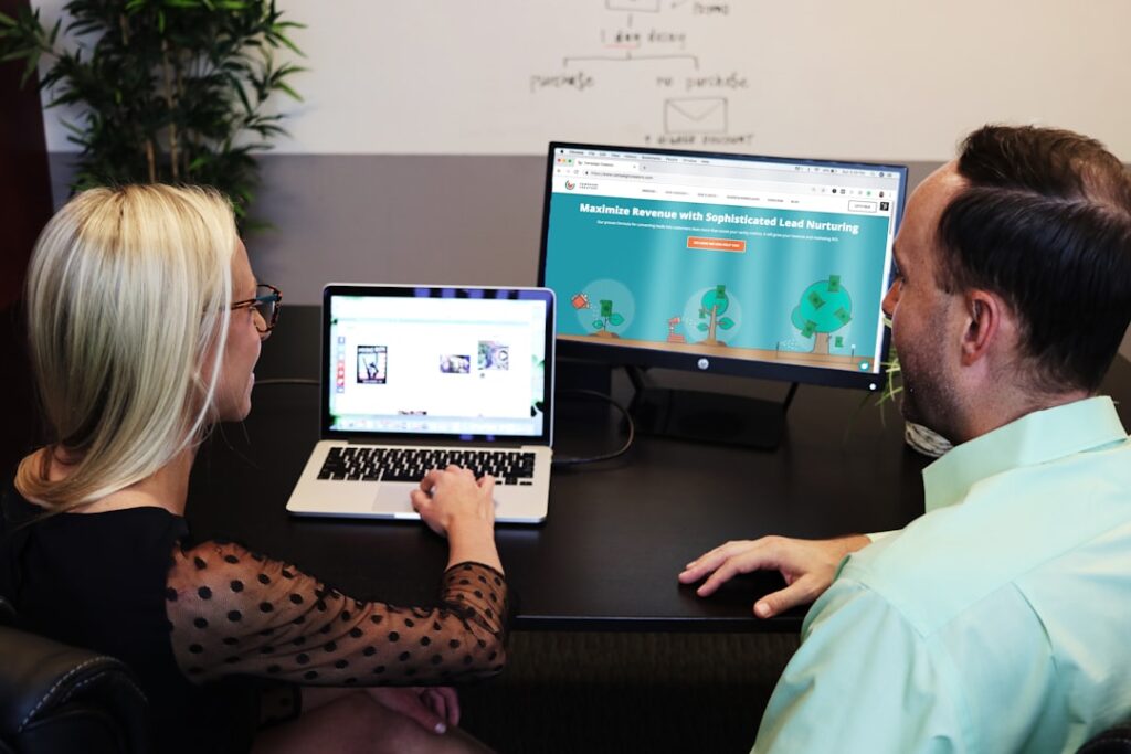
Low-converting landing pages rarely fail because of one catastrophic problem. They fail because of stacked friction points — individually minor issues that compound into a page nobody converts on. Here is what the worst examples have in common.
Message Mismatch: The Most Expensive Mistake
The single most common conversion killer identified across landing page audits is message mismatch. A visitor clicks an ad that says “Free Marketing Audit” and lands on a page with the headline “Our Services.” That disconnect costs 15–25% of conversions before anyone scrolls. The headline should mirror — or at minimum closely echo — the ad copy, email CTA, or search query that brought the visitor there.
Message-to-page continuity is called “scent” in conversion optimization. When it breaks, the visitor does not think “this must be what I wanted.” They think “I must be in the wrong place.” And they leave. One catch-all page almost never works for cold traffic across multiple ad angles.
Generic Social Proof
The second pattern in low-converting pages: social proof that does not prove anything. “Join thousands of happy customers” is not social proof. It is a placeholder. Nearly 92% of consumers read testimonials when considering a purchase, which means they are looking — and they know the difference between a real testimonial and a marketing sentence.
Effective social proof includes a named person, a company, a specific outcome, and ideally a photo. “Sarah M., Founder” converting is vague. “Sarah Mitchell, Founder of Brightwood Creative — we reduced our client acquisition cost by 60% in the first 90 days” is a conversion argument. Specificity is the variable that separates proof from decoration.
Generic CTA Copy
“Submit,” “Learn More,” “Get Started,” “Request Now.” These are autopilot phrases that create zero excitement and answer no questions. They are vague, passive, and forgettable. Personalized CTAs convert 202% better than generic ones. The CTA should describe the outcome the visitor is about to receive, written in first-person language.
Weak: “Download Now.” Strong: “Get My Free Audit.” Weak: “Sign Up.” Strong: “Start My 14-Day Trial.” The principle: make the visitor mentally claim ownership of the outcome before they click. That mental commitment is the conversion.
Navigation Left In
Sending paid traffic to a page that still has a full navigation menu is one of the most consistent and avoidable conversion leaks. Every additional link in a navigation bar is an exit path. Campaign-specific landing pages should suppress navigation entirely, keeping the header to a logo on the left and a single CTA button on the right. This is not a design opinion. It is a structural conversion decision.
Poor Post-Click Experience
Most landing page audits stop at the form submission. But the experience after the visitor clicks is equally important, and it is almost always ignored. A confirmation page that says “Thank you for submitting” and stops there is a missed conversion opportunity. A confirmation page that offers a relevant case study, a calendar booking link, or a specific next step keeps warm leads engaged while they are still in motion. The post-click experience is where the conversion either continues or collapses.
Apply These Insights to Your Own Landing Page
After reading through 27 examples, the temptation is to identify the visual pattern you like best and replicate it. Resist that. What converts is the message, not the aesthetic. The design of a high-converting landing page is a delivery vehicle for a specific argument made to a specific person. Get the argument right first. Then build the page around it.
The practical checklist drawn from every example above:
- Does your headline name a specific outcome or a named pain point — not a feature?
- Is social proof visible before your first CTA, not buried at the bottom?
- Does your CTA describe what the visitor gets, not what they have to do?
- Have you removed navigation from campaign-specific pages?
- Is your form asking for the minimum information needed at this stage of the funnel?
- Does your page load in under three seconds on mobile?
- Does your headline match the ad, email, or search result that brought this visitor here?
- Have you answered the three questions above the fold: What is this? Is it for me? Why trust it?
If you answered “no” to any of those eight questions, you have a specific, actionable place to start. One fix at a time, one variable per test. That is how the pages that convert at 11% got there from 3%.
Want a second set of eyes on your landing page before you invest in traffic? futurelinkz.com offers a focused conversion audit that identifies the specific structural and messaging gaps holding your page back. Book a 20-minute diagnostic session — no sales pitch, just a clear read on what your page is missing and what to prioritize first.
Frequently Asked Questions
What makes a landing page high-converting?
A high-converting landing page has one clear goal, a benefit-driven headline that speaks to the visitor’s specific pain point, social proof positioned before the first CTA, minimal form fields, and a fast mobile-optimized layout. The page must answer three unspoken visitor questions above the fold: What is this? Is it for me? Why should I trust it?
What is the average landing page conversion rate by industry?
According to Unbounce’s Q4 2024 Conversion Benchmark Report analyzing 41,000 landing pages, the median across all industries is 6.6%. Financial services lead at 8.4%, SaaS pages average 3.8%, and ecommerce landing pages convert at around 4.2%. Top-performing pages in any category consistently reach 11% or higher.
How many CTAs should a landing page have?
One primary CTA, repeated at natural scroll breaks. Research shows that adding a second conversion goal to a landing page can drop conversions by as much as 266%. You can use a secondary CTA (e.g., ‘Book a demo’ alongside ‘Start free’) only when you have two distinct buyer mindsets arriving on the same page — but both CTAs should move the visitor toward a qualified next step.
How long should a landing page be?
Page length should match offer complexity and price point. Free trials and low-cost SaaS tools convert well with 400–800 words. Demo request pages for mid-market products typically need 1,200–2,000 words to address objections. High-ticket consulting or coaching pages often need even more copy to build trust before asking for a call.
What is message match and why does it matter for landing pages?
Message match is the alignment between the ad, email, or search result that brought the visitor to the page and the headline they see when they arrive. When there is a mismatch — for example, an ad promising a ‘Free Marketing Audit’ but a landing page that says ‘Our Services’ — you lose 15–25% of conversions before anyone scrolls. The page headline should echo the specific language of the traffic source.