

The most expensive design mistake a founder can make is skipping the wireframe. Not because wireframes are a formality, but because they force a decision most teams avoid: what is this page actually trying to do, and in what order should it say it? Get that wrong in the design stage and you are just making a broken page look beautiful.
This guide covers 9 proven wireframe patterns for landing pages, organized by offer type and traffic temperature. No pixel talk. No color theory. Just hierarchy, flow, friction, and the psychology behind why each layout either earns a conversion or loses one.
Why Wireframe Before You Design
Wireframing forces you to resolve the structural decisions that design can never fix later. It is the step where you figure out what the page needs to say and in what order before anyone argues about fonts or button colors.
A good wireframe dramatically reduces the mental energy a visitor has to spend to understand your offer. It carves a clear, frictionless path from the headline right to your call-to-action. That is not a design outcome. That is a structural one, and it can only be planned before the design begins.
Here is the practical argument: when you skip the wireframe step and jump straight into design, you often end up with something that looks good but lacks clarity and flow, and that is a big reason why so many landing pages fail to convert.
The business case is equally clear. AltaLeads, a real estate cold-calling agency, achieved a 78% conversion lift after a landing page overhaul that emphasized visual hierarchy, mobile responsiveness, stronger social proof, and focused messaging. Every one of those improvements is a wireframe decision, not a design decision.
Wireframes are meant to be rough. If you are thinking about fonts and colors, you are probably overlooking the overall experience and flow between screens. That is the standard to hold yourself to. Solve the architecture first. Make it pretty second.
The 9 Wireframe Patterns (With Use Cases)
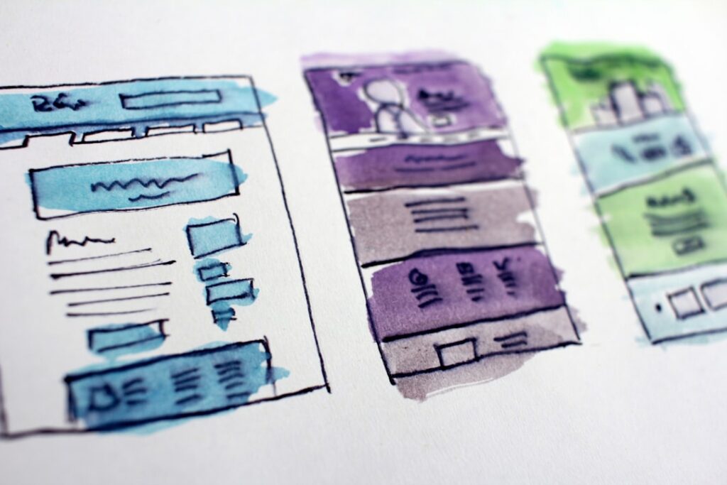
Every offer type has a structural logic that matches it. The table below maps each pattern to its ideal use case, traffic temperature, and the core conversion job it performs. Use it as a selection filter before you open a single design tool.
| # | Pattern Name | Best For | Traffic Temp | Primary Conversion Job |
|---|---|---|---|---|
| 1 | Squeeze Page | Lead magnet, ebook, checklist, webinar seat | Cold / Warm | Capture email with a single-field form and zero distractions |
| 2 | Click-Through Bridge | Pre-sell page before checkout or sign-up | Cold | Warm up the visitor before they hit the real conversion page |
| 3 | Long-Form Sales Page | High-ticket offer, course, consulting package | Cold / Warm | Build an airtight case over scroll depth; overcome skepticism section by section |
| 4 | SaaS Demo Request | B2B software, enterprise tools | Warm | Convince a busy professional the product is worth 30 minutes of their time |
| 5 | Free Trial Sign-Up | SaaS, subscription products | Warm / Hot | Remove risk; reduce the ask to the smallest commitment possible |
| 6 | Product Detail (DTC) | E-commerce, physical product, single SKU | Warm / Hot | Anticipate and eliminate every purchase objection in the scroll |
| 7 | Webinar / Event Registration | Education, coaching, live demos | Cold / Warm | Sell attendance; drive urgency through time, scarcity, and social proof |
| 8 | Lead Gen with Qualifier Form | Service businesses, agencies, consultants | Warm / Hot | Capture and qualify in one step; filter for fit before the sales call |
| 9 | Brand Positioning Page | Premium brands, positioning plays, inbound ICP | Cold / Warm | Establish positioning, build desire, and direct multiple audience segments to their next step |
Pattern 1: The Squeeze Page
This is the most ruthlessly focused landing page structure you can build. Its one job is to capture an email address from a visitor. The trade: a high-value asset like an ebook, a webinar seat, or an exclusive checklist. The wireframe logic: one headline, one sub-headline, one form field, one button. Every additional element is a leak in the funnel.
The conversion psychology here is reciprocity. The visitor gets something of perceived value; you get permission to follow up. The layout must never introduce a competing decision. No navigation. No links. No “learn more” rabbit holes. The only choice on the page should be: submit or leave.
Pattern 2: The Click-Through Bridge
The click-through bridge has no form. Its job is simpler: warm up the visitor and convince them to click through to the real destination, which is usually a checkout or a more detailed sign-up page. This pattern works brilliantly for cold paid traffic where asking for a purchase or sign-up in the first second of contact creates too much friction.
The wireframe structure is: a problem-agitation headline above the fold, a brief narrative section that bridges the ad’s promise to the offer, and one compelling CTA that sends them forward. The psychology is commitment and consistency. The micro-yes of clicking through primes the visitor to convert on the destination page.
Pattern 3: The Long-Form Sales Page
The landing page UX design here is all about building an insurmountable case, wearing down skepticism one section at a time until the final CTA feels like the only logical next step. This pattern is reserved for high-ticket or high-commitment offers where trust must be earned through scroll depth.
The wireframe sequence typically runs: problem statement, agitation, solution introduction, proof (case studies, testimonials, data), feature-benefit breakdown, objection handling, guarantee, CTA. Cold traffic and high-ticket offers need more context; warm traffic and low-ticket offers convert on shorter pages. If your offer costs more than a visitor would spend without thinking, you need this structure.
Pattern 4: The SaaS Demo Request Page
For B2B software, the demo request is the holy grail. This layout is engineered to convince a busy professional that your software is worth their time. It is a delicate balance of information and persuasion.
The wireframe anchors on three structural elements: a hero section with an unambiguous CTA (“Book a Demo” or “See It in Action”), a social proof belt showing logos of recognizable customers, and a tight feature-benefit section that answers the question “what will I see in this demo?” Quantified social proof in the first fold matters here. Performance statistics appear immediately, giving technical buyers the numbers they need before scrolling. This is not decorative: technical decision-makers evaluate tools by specifications, not promises.
Pattern 5: The Free Trial Sign-Up Page
This pattern’s entire job is to make the ask feel small. Effective SaaS trial pages include a product screenshot or short demo video that shows the interface in action. This reduces the unknown; prospects can see what they are signing up for before they commit.
The form on these pages typically asks for email and password only. Progressive profiling, collecting additional information after sign-up, has become the norm because reducing initial form friction significantly increases trial starts. In the wireframe, the form should appear above the fold, flanked by a short list of what the trial includes and a single line of reassurance (no credit card required, cancel anytime).
Pattern 6: The Single-Product DTC Page
When you need to put a single product or service under a microscope, this is your layout. It is built to anticipate and answer every question a potential buyer could have. The structure guides the user through a logical flow of product shots, feature-benefit breakdowns, specs, reviews, and a CTA that is always within reach.
The critical wireframe decision here is review placement. One e-commerce brand moved their review count from the footer to directly beneath the hero headline, and conversion rate increased 18% in the following two weeks with no other changes. Social proof is not a footer element on a product page. It belongs in the first scroll.
Pattern 7: The Webinar Registration Page
Webinar pages are consistently among the highest-converting page types. Analysis of landing pages promoting webinars found an average conversion rate of 22.84%, compared to an overall average of 10.76%. The wireframe structure that drives those numbers is built around specificity and urgency: a clear date and time above the fold, a description of what the attendee will learn (not just what will be discussed), the host’s credentials, and a visible countdown or seat-scarcity indicator.
The form should be minimal. Name and email is the standard. One form field converts higher than two or more. Adding a first name field introduces friction, even when it looks minimal. The registration page is not the place for qualification. Save that for the follow-up sequence.
Pattern 8: The Lead Gen Qualifier Page
This pattern is built for service businesses, agencies, and consultants who need to capture a lead and filter for fit in one step. The wireframe introduces a multi-step or multi-field form that feels progressive rather than intrusive: the first screen asks easy questions (what is your challenge?), and deeper questions (budget, timeline, team size) appear later in the sequence.
A three-field form increased leads by 40% compared to lengthy forms in a tested lead gen scenario. But service businesses often need qualified leads more than high-volume leads. The qualifier form accepts a lower volume in exchange for higher close rates. The wireframe must make the form feel like a dialogue, not a job application. Progress indicators, reassuring microcopy, and a clear description of what happens next all reduce drop-off.
Pattern 9: The Brand Positioning Page
This is the most misunderstood pattern. It is not a homepage. It is a long-form brand statement built to establish positioning, attract the right ICP, and direct different audience segments toward their appropriate next step. Premium service brands, boutique agencies, and founders building authority in a space use this pattern most effectively.
The wireframe hierarchy works differently here. Rather than a single CTA repeated throughout, this layout uses section-specific CTAs: a “Work with us” path for buyers, a “Read our thinking” path for researchers, and a “See case studies” path for skeptics. The unifying thread is a clear point of view in the hero, not a generic value proposition. The page earns trust by demonstrating competence before asking for anything.
Pattern Breakdown: Cold Traffic vs. Warm Traffic Layouts

Traffic temperature is one of the most underused filters in landing page design. The same offer needs a structurally different page depending on whether the visitor already knows you. Get the match wrong and even a well-written page will underperform.
Warm traffic typically converts 2–3x higher than cold across opt-in page types. That gap is not a creative gap. It is a trust gap. Warm traffic visitors already have enough context to evaluate your offer. Cold traffic visitors are still deciding whether you are worth their attention. Your wireframe structure has to account for where that trust gap starts.
How to Wire a Cold Traffic Page
The first fold of your landing page, the hero section, is your make-or-break moment. For cold traffic, it must work overtime to communicate your brand’s core essence and value proposition instantly.
Cold traffic pages need more structural scaffolding before the ask. The wireframe should lead with problem framing (not your solution), establish credibility with social proof in the first scroll, and build a logical case before presenting the CTA. The message must match the ad or the channel that drove the click. The single biggest leak on most landing pages happens before the visitor reads a word. They clicked an ad about one thing and landed on a page headlined with something completely different. The promise broke in the first 200 milliseconds, and bounce rate did the rest.
For cold traffic, the wireframe should also suppress navigation and external links. Landing pages need a stronger visual hierarchy, more aggressive CTAs, tighter messaging alignment with the ad, and no exit paths: no navigation, no footer links, no distractions.
How to Wire a Warm Traffic Page
Warm traffic visitors already know you. They have been to your site, seen your content, or clicked a retargeting ad. They do not need to be convinced you are real. They need to be convinced it is the right time to act.
Wireframes for warm audiences can be shorter. The hero can lead with the offer directly, not the problem. The CTA can appear earlier, because trust is already partially earned. Urgency signals (limited availability, a time-bound offer, personalized copy) work harder on warm audiences than on cold ones, where urgency without trust reads as pressure. Hot traffic includes users who are ready to make a purchase. They have either added items to their cart, requested a quote, or repeatedly visited a product page. They trust your brand and just need a final nudge, such as a limited-time discount, a review, or a seamless checkout process, to convert.
Hierarchy Principles Every Landing Page Must Follow
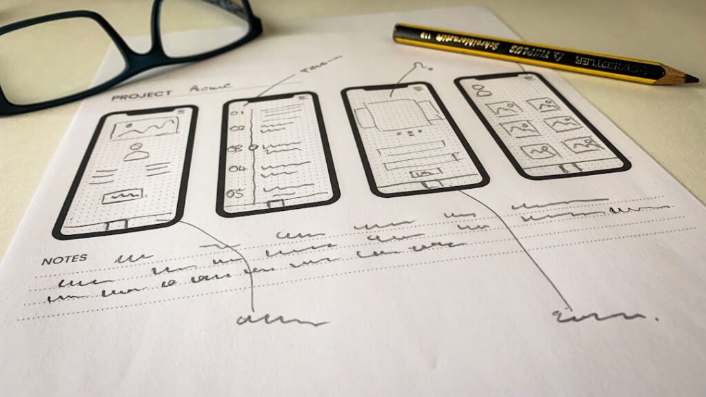
Hierarchy is the sequence in which your page delivers information. Get the sequence wrong and it does not matter how strong your offer is. The visitor will not stay long enough to see it.
Map content from most important to supportive: value proposition, then benefits, then proof, then CTA. That is the skeleton every wireframe should start with. Here is what that means in practice:
Above the Fold: Earn the Next Scroll
Above the fold should have one job: communicate enough value that the visitor wants to scroll. That is it. You do not need to close the deal in the first 600 pixels. You need to earn the next 600 pixels.
A clean above-the-fold section typically needs: a headline, a sub-headline that adds one supporting detail, a single CTA, and optionally one trust signal such as a customer logo or a key metric. Everything else belongs further down the page.
Trust Signals: Timing Matters as Much as Placement
Place trust elements strategically: add testimonials, security badges, or guarantees near CTAs and decision points. This is not about decorating the page. It is about meeting doubt at the exact moment it arises.
Trust needs to appear at the exact moment doubt enters the user’s mind. That moment usually comes early, not at the end. It often shows up right after the headline when the user is trying to understand the offer, in the middle of the page when they are comparing options, and just before the CTA when they are deciding whether to act.
One Primary CTA, Repeated With Purpose
Multiple CTAs with the same goal, such as the same “Start Free Trial” button appearing at the top, middle, and bottom of a long page, do not hurt. Multiple CTAs pointing to different actions compete for attention and tend to reduce conversion on all of them. One primary action per page, consistently repeated, is the safer approach.
The wireframe discipline here is to define your primary CTA before you lay out a single section. Every other element on the page either supports that CTA or gets cut.
Scan Patterns: Design for How People Actually Read
Eye-tracking studies reveal that visitors place their attention at common fixation points, typically the top left, center, and along predictable scanning patterns like the F or Z layout. Put your most important information there.
Research from NNGroup shows users often read only about 20–28% of the content on a page. Your wireframe structure needs to work even for the visitor who only reads your headlines, sub-headlines, and button labels. If those three layers of copy do not tell a complete story, your conversion rate will reflect it.
Common Design Mistakes That Kill Conversions
Most conversion problems are not design problems. They are structural decisions that were never made, or were made wrong. Here are the most common ones to audit in your wireframe.
Burying the Value Proposition
In many cases, users decide within 5–7 seconds whether to stay or leave. If your message is not clear in that window, your landing page conversion rate drops significantly. If the headline of your page describes your company rather than the outcome the visitor is seeking, you have buried your value proposition.
The wireframe fix: the first heading on any page should complete this sentence from the visitor’s perspective, “I want to ___.” Not “We are a ___.” Not “Welcome to ___.” The offer, the outcome, the transformation. That goes first.
Message Mismatch with the Traffic Source
The single most common conversion killer found in landing page audits is message mismatch. A visitor clicks an ad that says “Free Marketing Audit” and lands on a page with the headline “Our Services.” That disconnect costs you 15–25% of your conversions before anyone even scrolls. The fix: your landing page headline should mirror, or at minimum closely echo, the ad copy, email CTA, or search query that brought the visitor there.
Overloading the Form
For lead gen campaigns, your form is your conversion event. Most forms are designed by people who have never studied conversion psychology. Every additional field reduces completion rates.
The phone number field triggers the highest abandonment of any common form field and rarely pays back the lost entries unless your sales motion genuinely requires it. Company size, role, and use case fields are close behind. In the wireframe, start with the minimum viable form and add fields back only when you have evidence the data will change the sales conversation in a meaningful way.
No Visual Hierarchy in the Layout
A landing page overloaded with text, images, and unnecessary elements confuses visitors and makes it hard for them to find what they need. Without a clear visual hierarchy, users do not know where to look first, which can cause them to miss the value proposition or CTA entirely.
A useful self-audit: print your landing page in grayscale and look at it. Whatever stands out most is what visitors will look at first. If that is not your headline or CTA, the hierarchy needs work.
Ignoring Mobile Structure
Over 62% of website traffic now comes from mobile devices, yet many wireframes are still planned desktop-first. This creates issues with flow, button spacing, and readability. A layout that works beautifully on a large monitor often collapses into an unreadable stack on a phone. Mobile wireframing is not a second step. It is a parallel constraint that should be resolved at the same time as the desktop layout.
A one-second delay in mobile load time drops conversions by up to 20%. Before you optimize a headline or test a CTA color, make sure the structural experience on mobile is clean, fast, and obvious.
Start With a Teardown of Your Current Page
The fastest way to apply everything in this guide is not to build a new page from scratch. It is to run your existing page through each of the frameworks above and identify the first structural failure.
Ask yourself: Does the above-the-fold section communicate the offer clearly enough that a stranger would understand it in five seconds? Is the trust signal appearing before the first moment of doubt, or after it? Does the CTA match the temperature of the traffic hitting the page? Is the form asking for less than the visitor is comfortable giving at this stage of the relationship?
A practical audit question to ask yourself: look at your landing page and ask, “What is the one thing I want this visitor to believe or feel before they click?” Structure your page in this order: what it is and who it is for (headline and subheadline), then why it matters right now (urgency, context, or problem framing). Every section that does not serve one of these functions is potentially costing you conversions.
The patterns in this guide are the same frameworks we use at futurelinkz.com when we audit and rebuild landing pages for founders who are tired of sending paid traffic to a page that looks good but converts poorly. If you want an outside set of eyes on your current page structure, we offer a free conversion audit that goes section by section through hierarchy, trust signal placement, CTA logic, and traffic-temperature alignment. Book your free landing page teardown and see exactly where your page is leaking conversions before you spend another dollar on traffic.
Frequently Asked Questions
What is a landing page wireframe and why does it matter for conversions?
A landing page wireframe is a structural blueprint that maps out the layout, hierarchy, and flow of your page before any design work begins. It matters for conversions because it forces you to decide what information appears in what order, which directly determines whether a visitor understands your offer quickly enough to act on it. Pages designed without a wireframe often look polished but fail at the structural level, burying the value proposition or placing trust signals too late.
How do I choose the right wireframe pattern for my landing page?
Start with two filters: your offer type and your traffic temperature. A high-ticket service needs a long-form layout that builds trust over scroll depth. A SaaS free trial needs a short, friction-free form above the fold. Cold paid traffic needs more structural scaffolding and message-matching before the ask. Warm traffic from email or retargeting can lead with the offer directly. Match the layout to where the visitor is in their decision journey, not to what looks best in a design tool.
How does traffic temperature affect landing page layout?
Cold traffic visitors are seeing your brand for the first time and carry no prior trust. Their landing page needs to earn credibility before making an ask, which means more proof, more problem framing, and tighter message-match with the ad that drove the click. Warm traffic visitors already know you and just need a reason to act now, so pages can be shorter, lead with the offer directly, and use urgency signals more effectively. Using a warm-traffic layout for cold traffic is one of the most common and costly structural mistakes in paid advertising.
How many CTAs should a landing page have?
One primary action per page, repeated at logical intervals as the visitor scrolls. Multiple CTAs pointing to different actions, such as Start Trial, Book a Demo, and Download Guide all on the same page, compete for attention and reduce conversions across all of them. The same CTA repeated at the top, middle, and bottom of a long-form page is fine and generally improves conversion on pages with significant scroll depth.
What is the biggest structural mistake founders make on landing pages?
Message mismatch. The visitor clicks an ad or email that promises one thing and lands on a page that says something different, even slightly different. The brain registers this as a broken promise in the first few seconds, trust drops, and bounce rate spikes. The fix is mechanical: the headline on the landing page should mirror the primary phrase or promise of the ad, email, or search result that drove the click. If you ran six ad variants, you likely need six landing page variants, not one generic page trying to absorb all of them.